

 This still looks fine, but they can't carry it through the rest of the movie.
I have no objection to black and white films. In fact, I'd guess that about a third of my movie collection is in black and white. But I do sometimes wonder why people make movies in black and white these days. It's not like the Forties and Fifties where black and white was a cheap option. More often than not, it comes across as pretentious rather than stylistic.
Spielberg got away with it in Schindler's List, but only because of that one famous image of the girl in the red dress. Putting everything else into monochrome made that single shot into an unforgettable (and much copied) piece of movie legend.
 A single, unforgettable touch of colour.
But a movie like Good Night And Good Luck, the biopic of anti-McCarthyite crusader Vic Morrow, had no need to go monochrome. Obviously it was done to create the period feel, and to keep the archive footage homogenous, but this didn't really work. Instead, it just made the film look drab and cheap rather than historical. It looks as if it was shot using standard modern kit, and post-processed to have the colour removed. The result doesn't look like 1950's film stock, it looks like a modern digital effect, and that, for me, ruined it.
There were a number of other reasons I didn't like GN&GL (such as the slow story, confusing sound mix, and unengaging characters), but the decision to go black and white offended my cinematographic sensibilities. If you're going to make a colourless film these days, you need to replace colour with some other visual element. This means an excellent grasp of composition and lighting. You can't just shoot as normal and then take the colour out. It doesn't work that way. It's like colorising black and white movies - wrong, wrong, wrong!

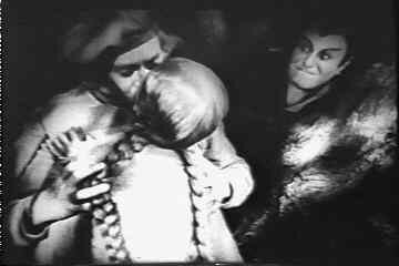
Paul Wegener's unique visual style in Der Golem (1915)
When you work without colour, you need to be thinking of every shot in terms of shape. Ignore what you see through the lens - you have to understand what the image will look like when bereft of colour and reduced to light and shadow.
 Murnau's Faust. Wonderful composition. The nearest you get to this in colour is Herzog's Nosferatu
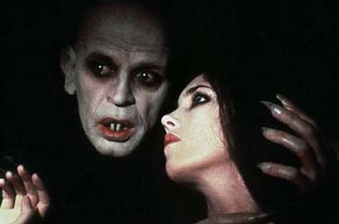
Herzog uses heavy black backgrounds to emulate Murnau
The German Expressionists - Murnau and so on - were the real masters of this style, taking it to extremes. Sean Branney's excellent Call of Cthulhu, a homage to the silent horror movie, is one of the few recent films that makes this work. Or look at Jim Jarmusch's poetically beautiful Dead Man, where every shot is a memorable still photograph. And don't forget the hugely stylish Sin City, which transplants the unique look of Frank Miller's comic book to the screen, and really pushes for black and white, not greyscale.
 As striking as Jack Sparrow, for my money
One key issue when filming black and white is that the differentiation between foreground and background has to be rethought. A red costume against a blue background may look fine, but if the tone is too similar, you get grey on grey and the character gets lost. To bring that differentiation back, you can use focus to blur the background out, but that's a real problem with some modern film kit, and especially with digital animation like machinima. You can also accentuate the difference with lighting, but that's also a problem for machinima which generally has very little lighting control.

The sort of lighting effect you only really get from black and white
For the machinimator or digital animator, the answer is to direct in black and white from the get-go. Don't take colour footage and post-process it, lose the colour right away. That's a luxury real film-makers don't always have.
I may try making some black and white machinima - one of the scripts I'm working on is inspired by Orson Welles' Mr Arkadin (aka Confidential Report), and I reckon that's the feel it needs. Now I need to persuade the Moviestorm dev team to make a black & white shader to go with the cel shader they've already done! One of the very few Welles films I like, worth watching just for the grotesque characters
1 comment:
Great post, Matt - very thought-provoking.
I am a huge fan of black-and-white classic films, with Random Harvest and Mrs. Minner ranking among my favourites. And of course, pretty much anything with Errol Flynn.
And when I got started in stills photography, I most often did B/W - that was the probable influence of my early movie-viewing. Also, when I moved out on my own, I only had a b/w tv which also explains that movies I had ORIGINALLY thought to be B/W were actual colour (Adventures of Robin Hood springs to mind).
I have to say that the visual imagery of little girl in the red coat in Schindler's List was very disturbing for me in that it made the movie even more effective.
I can't wait to check out B/W possiblities that the Moviestorm elves will hopefully be cooking up in the next short while. That'll be quite the feature!
Post a Comment